
What do you think of as a brand? Is it name? Logo? Influencer? Material? Or is he a designer or?….
Probably nobody can imagine when creating a brand what its logo look like in the final form. It will change many times after its final appearance. Millions of discarded papers, with shots ranging from the fiction of the world to the kind of logo that still might not be final. The same was true in our case, where we groped and drew and drew and the logo was out of sight. With the launch of the brand somewhere in 2015, we gave the final brand name TheGentlemens!
The very first logo we officially launched looked like this:
This was the very first logo that represented us before launching the eshop on our blog. Later, when we launched the e-shop, only the first letter remained of the logo and the name moved below the logo, it looked like this:

First Logo Sketch:

With the e-shop we have also made a few boxes for easier transfer to customers and to be at least a little different from the competition. They looked like this. They are no longer used today.

If you love what you do and spend all of your time, you would still invent something new and new. Sometimes and it is not only in my case it happens that many ideas you have in your head, they may even on paper but they will not see the light of the world ever. You may sometimes remember them, but the development goes so far that it would never be feasible. The same goes for the logo. At the beginning I would change it about a hundred times. Time has passed and I had to say goodbye to this as well. The name was thrown away and only the "G" remained. This type of logo was used the most and we started placing it on the back of the clothes down and was in the form of a woven label. We haven't used this form in a long time, I don't really like the truth. To date, this type of placement uses, for example, the Sixth june tag. Another turning point came and we decided on the embroidered form of the logo. The placement remained the same on the back underside. Later we updated him that we first pre-embroidered it on a piece of material and then tufted it on the products. E.g. with cardigans, this type of embroidery has remained the same to this day.

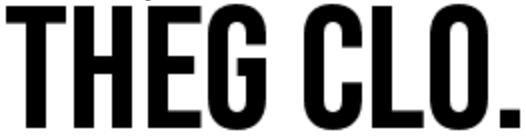
We used this type of logo recently. Before Christmas, we decided to make it a little bit too, because initially "the" was not very embroidered on thin materials, from which we make T-shirts. We enlarged the lines a bit and also made the circle coarse and round in shape, reminiscent of an oval. Today it looks like this:

Little detail but a lot has changed. It started to be embroidered better and looks much better on the finished product, especially T-shirts. This is the final form of the logo that is still used today. Since the very beginning after more than 2 years it has undergone 4 changes and we are already preparing a new form that will be even more sophisticated and even more perfect. I believe it will be the final final form of the logo. Sometimes it is not very good if the logo changes many times. People are fast on something very quickly and when the change comes either it's positive or not. In our case the logo did not change much, the base always remained the same. But it will not be in the new upcoming logo. We are going to change it from the ground up and give it a new touch :) The brand will of course remain the same, but the logo will change to 99%. But we believe and hope that everyone will like it and it will be the last form. You can find out more about the information continuously.
The new logo should see the light of the world with the new upcoming collection and will look like this:
